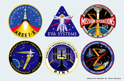
Graphic artist on the final frontier: an interview with Mike Okuda<< page 1: working on Star Trek When did you first get involved in designing actual space mission patches? How did that happen? The first patch I did for NASA was an Exploration emblem for ESMD. Shortly after NASA announced Project Constellation, I figured that they’d need an emblem for the program. I e-mailed Bill Readdy, who put me in touch with Admiral Craig Steidle, who was in charge of Constellation at the time. I did a bunch of concepts for them, and they decided they wanted to use it for ESMD instead. Ultimately, there were two versions of the Exploration emblem. The “official” version, and there was an internal version that had the motto “Audentes Fortuna Juvat” in Latin and an English translation, “Fortune favors the bold.” I ultimately ended up doing an emblem for Constellation, as well. At about the same time, Bill Foster of JSC’s Ground Control office asked me if I’d help him design a commemorative patch, honoring the flight crews of Apollo 1, Challenger 51L, and Columbia 107. I think he originally just wanted a graphic to display on one of the big screens in Mission Control when they have visitors. Anyway, that evolved into the “spaceflight memorial patch,” and it’s now hanging on the wall of the space shuttle mission control room, right next to the mission patches for Apollo 1, Challenger 51L, and Columbia 107. And to my considerable surprise, it even ended up on the back cover of the Columbia Accident Investigation Board’s report. You actually did some space mission patches for an episode or two of Star Trek: The Next Generation, right?
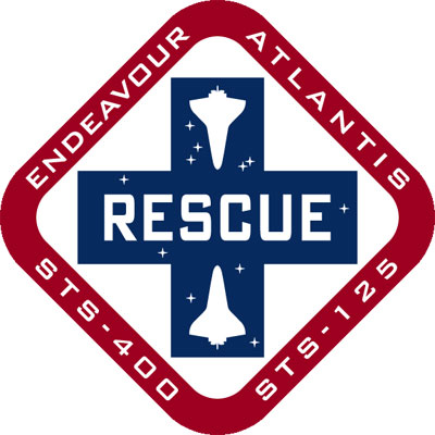
We didn’t do many mission-type patches in Star Trek: The Next Generation, mainly because I didn’t want to be in a position where we had to come up with a new badge every time we ran into a new ship. A few years later, when we did Star Trek: Enterprise, the producers wanted a more NASA-like vibe, so I did quite a few emblems for Bob Blackman, our costume designer. Wendy Drapanas, Geoff Mandel, and Alan Kobayashi also contributed some patches. What influenced you when you started doing the patches? How did you go about designing them? Obviously, each design is different, and I try to be guided by the wishes and needs of the people who will be represented by the patch. I usually start by talking with someone in the group to get a feel for their goals, and I try to understand how they see themselves. I try to find out if there are specialized needs or if they are trying to communicate something specific to a particular audience. Once you have a sense of the technical requirements and goals, you can start trying to do something cool. I love the style of military unit or squadron emblems, that wonderful sense of bravado, since that’s such a big part of NASA’s culture. I try to let the practicality and elegance of corporate identity graphics inform my work, as well. I try to design things that are legible at a distance, even when it’s small in the corner of a PowerPoint presentation or rendered in a low-resolution medium like embroidery. Are there any non-obvious restrictions when doing a NASA patch? Are there colors or fonts that you cannot use? Not really. Trying to keep it simple enough for rendering in embroidery and cloisonné pins. And restricting the total number of colors for the same reason. Also, it makes life easier in dealing with vendors if you stick to industry-standard PMS (Pantone Matching System) colors. How many patches did you do and how did they come about (i.e. did you compete for each of them, or were you commissioned)? STS-125 is the only space shuttle mission patch I’ve done. I guess Ares 1-X counts as a mission patch, too. The other emblems were for various programs and such. Oh, and the team emblem for STS-400, that’s the planned rescue mission in case there are serious problems on STS-125. That one’s not an official NASA patch, though. Mostly, I’ve been asked. I’m sure that the STS-125 crew was considering other designs. The only patch that I actively solicited was the Exploration emblem.
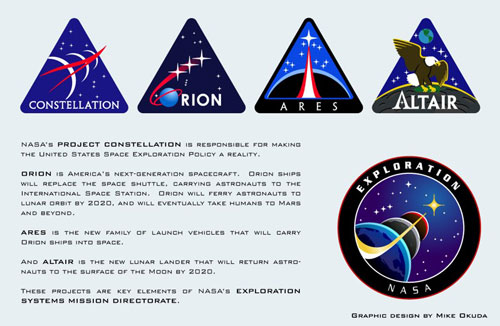
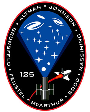
How did you end up doing the Constellation, Ares and Orion patches? After I did the “spaceflight memorial patch” with Foster, Jeff Hanley asked me if I’d be interested in redesigning Bob McCall’s classic Mission Operations emblem to include the space station and to reflect the new goals of returning to the moon and going on to Mars. Sometime after that, Hanley became program manager for Constellation, and he asked me to contribute to that, too. What did you want to achieve with the patches? Who did you work with? Who offered suggestions and ideas? How did the designs evolve? Again, the specific design goals for each patch varies, but in general, I want the people in that group or crew to feel that it represents them and their commitment to their work. I like to work with a single point person, who then serves as a liaison to the group. Most of these groups make these kinds of decisions by consensus, and sometimes management has some specific things they want, too. For the STS-125 patch, John Grunsfeld was the point person for the crew. Each time I did a new variation, he’d present to the crew, and he’d give me feedback, so the STS-125 crew were definitely collaborators on that design. Are there any aspects of a design that you know a priori won’t work? Any shapes or colors? Nearly any given element can be made to work, given an appropriate context. If you have a hard-to-read typeface, you can probably make it legible by making it big enough. Doing so, however, would probably require something else to be simplified or omitted to make up for it. I’ve looked at a lot of shuttle mission patches—I’ve got about 90 of them framed in my study—and a couple of dozen of them stand out. But most of them are circles with stuff in them (one of my favorites is STS-43, which used the shape of a Mercury spacecraft, and STS-38, both the public and the secret versions). After so many of them, it’s rare for a truly new or original approach. Do you have any favorites? First, let me say that I think there are a lot of really cool space shuttle patches, and a lot of talented people did a lot of really excellent work on them. I’ve got a bunch of them, too, although I’m not so organized as to have them framed or displayed properly.
After over a hundred missions, it’s not at all surprising that some patches look similar. After all, each patch’s designer was working with many of the same constraints and trying to accomplish many of the same goals. That said, my favorites tend to be the ones that have a strong main message, which communicate that message in an elegant, effective way. My favorites are STS-1, the first flight of the program (designed by the legendary Robert McCall), and STS-26, the return to flight after the Challenger accident. I love the clean approach of STS-75, the tethered satellite experiment. And STS-96, which was the first shuttle launch that Denise and I saw, and a nice interpretation of the astronaut pin. I really like a lot of the recent patches: STS-122, 123, and 124, all of which are strong, elegant designs.
What was your inspiration for the STS-125 patch? John Grunsfeld indicated that the crew wanted to convey the importance of the Hubble Space Telescope. But I wanted to see it as much more than a device to gather photons. I wanted to see it as this magnificent spotlight, revealing the grandeur of the universe wherever it’s aimed. My unofficial name for the patch is “Hubble Illuminates the Cosmos.” Tell me about the STS-400 team emblem. Paul Dye, the lead flight director for the rescue mission, wanted an unofficial space rescue logo for his team. Obviously, no one wants to see that one in actual flight, but he had been getting requests for a patch, I think mostly for report covers and Powerpoint presentations, just for internal use. It turns out that Paul has a background as a firefighter, so he liked the idea of the square cross that evoked the tradition of emergency rescue and first responders.
As someone who has probably looked at a lot of mission patches, which ones do you like the most and why? Apollo 11 is my all-time favorite. America going to the moon in peace for all mankind. That’s it, but it’s everything important about that mission. Possibly the most elegant and powerful mission emblem ever designed. You’re right, it’s a great design. I’m also a fan of the Apollo 13 patch, even more so once I learned about the painting that inspired it. What are your hobbies? Lately I’ve been rediscovering photography. The advent of digital cameras has totally opened up the field for me because you’re no longer paying for each click of the shutter. This gives you an enormous freedom to try things that you wouldn’t if you were paying for film and processing. You always learn something from “bad” photos, and sometimes you discover something wonderful. I’m doing that too. The problem is that I end up with 100 nearly identical photos, trying to determine which one is the best lit. What television do you watch, admire, enjoy? My current favorite shows are Mad Men, Boston Legal, Lost, Battlestar Galactica (new), and Sunrise Earth. I just finished watching Firefly on DVD, great stuff! Fringe looks promising. My all-time favorite shows are the original Star Trek, From the Earth to the Moon, The West Wing, and MASH. And The Muppet Show. Who’s your favorite Muppet? Definitely Gonzo the Great. If you had a dream job, what would it be? Working as Gonzo’s understudy. You know he’s into chickens, right? What are you doing now? A bunch of things. Denise and I just wrapped up working on visual effects for the HD remastered versions of the original Star Trek series. We are doing some graphics for a Warner film called The Informant. (Stars Matt Damon and Scott Bakula, should be out next year). I’m doing a title design for a documentary. I’m currently working on a couple of logos for departments at JSC and a couple of new emblems for Constellation groups. We just finished helping out on a short film for the Department of Justice, and we have some ongoing work for CBS Consumer Products. And we’re going to try really, really hard to get away to Florida to see the launch of STS-125! From the 1970s until the early 1990s NASA used the “worm” logo. I don’t think it was ever that popular, but it was graphically distinctive and was different than any other government logo. Today NASA only allows the public use of the “meatball” logo. Does this bother you? Well, obviously I’d love to see one of my logos on the side of a rocket or spacecraft. At the same time, I very much respect NASA’s policy that the “meatball” logo is the graphic identity of the space agency. The NASA meatball is one of the most recognizable trademarks in American culture, and its consistent use benefits the entire space program. That said, I think that secondary and tertiary emblems can be important team-building tools, and I believe they can be used in ways that maintain the strength of the meatball logo as NASA’s primary identifier. Patches are an important part of NASA’s culture. Everyone I’ve ever met at NASA and its contractors is proud to be part of the space program, and they are always especially proud of their specific contribution to the effort. Program and mission patches help focus this pride, and help to maintain each group’s sense of purpose. The patches and logos and clothing are clearly a way to tie a group together, to separate themselves. But it’s a weird thing—if you wear your polo shirt with the mission patch on it out in the general public, all the context is lost and people just think you’re weird. You’re probably right about polo shirts with mission or project emblems. But who cares? Besides, how is my Altair shirt any weirder than that guy with a Green Bay Packers jacket? It’s the context, really. Plus the fact we’re nerds. A fat guy in a Green Bay Packers jacket considers himself a jock, even if the most exercise he gets is lifting a beer. But a polo shirt with a space mission logo, outside of the Houston or JPL environments, is more of an invitation for somebody to spill your books on the ground. That said, we nerds can design robots to take over the planet and enslave humanity, so we’ll have our revenge some day. Tell me about your role in suggesting the name Altair for the lunar lander. Early in the LSAM program, Jeff Hanley invited various people, inside and outside of his group, to submit suggestions for names for the lander. I wrote up a couple of pages of ideas and notes. Just before I sent it off, I popped my head into the next room and asked Denise if she had anything she wanted to add. “Altair,” she said immediately. “From Forbidden Planet,” she added. Altair, of course, also means “The Flying One” and is a star in the constellation Aquila, the eagle. I thought it was pretty cool, so I added it to the list. Many months went by, and we didn’t hear anything. Even when I was asked to do the program patch, there was a fair amount of time when they didn’t have a final name. For a while, it looked like it might be “Pegasus.” Anyway, when they finally announced the name, we were both thrilled. We’re certain that others at NASA also suggested Altair, but as far as I’m concerned, Denise named the lunar lander! What’s the hardest aspect of designing mission patches and emblems? Once you’ve gotten an understanding of the goals and parameters of a given emblem, the hardest single aspect of mission and project patch design is probably controlling the number of elements. The more ideas you try to convey with an emblem, the less overall impact that emblem will have. I often try to show the client that a smaller number of secondary elements can help support their goals by making their identity stronger. Of course, one of the most important design goals is that the team must feel that their emblem represents them. A NASA team emblem is different from a corporate logo in that the most important audience is usually the team members, and the general public is often a secondary audience. So if the team really wants an additional element or two, I’ll usually try really hard to accommodate them. So how do you design these things? Do you work with pencil and paper or start with the computer? What equipment and software do you use?
I like to start out with a few pencil sketches. Freehand sketches can free you from the prejudices imposed by the tools of a given software program. When I’m crunched for time, I will often forego the pencil stage and start “sketching” immediately in Adobe Illustrator. An advantage of keeping things in the digital realm is that it’s easy to create variations, and it’s simple to create a quick web page with the sketches, so the clients can see them, even if they’re spread across the country. Besides Illustrator, I use Photoshop a lot, plus Adobe After Effects for motion graphics. I do most of my work on a Macintosh G5 tower or my MacBook Pro Intel laptop. What was the easiest patch you’ve ever designed? Without question, the Ares project patch. Early on, Jeff Hanley told me that he wanted all of the Constellation program emblems to have some commonality, so they’d all look like they belonged in the same family. I did a bunch of quick concept sketches, showing a bunch of different emblems, all tied together by a rounded triangle background. They were just intended to show how a loose system of a few common features might keep different emblems in the same visual family. I used some of the notional names for the CEV and the CLV that were floating around at the time. One of those notional names was Ares, for the launch vehicle. Initially, I was to do a logo for the launch vehicle program first, but then the logo for the CEV, which was named Orion, was pushed ahead in the queue. Anyway, I immediately jumped on that one. Near the end of the Orion design process, I got an e-mail asking for the art for the Ares logo. I figured that this meant that someone else had done Ares, since I had been working on Orion. It wasn’t until the Ares logo showed up on the NASA website that I realized that they were using my very first sketch! Unquestionably, the easiest logo I’ve ever designed. Who inspires you as a graphic artist? One of the most influential American graphic designers was the late Saul Bass, who was one of the artists who developed the discipline of “corporate identity” graphics as we know it today. Bass was only secondarily concerned with coming up with a pretty design. Bass was first and foremost concerned with using graphics as a tool for communicating specific ideas. The design work must be guided by the knowledge that the graphic exists to accomplish a particular goal. I try to be guided by that ethic. I’m not familiar with Bass, but that doesn’t really sound like a style. Some artists—Bob McCall immediately comes to mind—have a clear style. McCall never paints a black spacefield. He uses lots of light blues and pastels and stars. But I’m also not sure that McCall’s approach works for a patch, at least more than once (McCall did the STS-1 and STS-71 patches). What are your thoughts on this? Do you have a “style” for your work? Or is each job different? I’m aware that my NASA emblems do have a unifying style, but most of that “style” is simply the result of trying to address similar design issues within similar constraints. I thought McCall’s patch for STS-1 was extremely effective as an emblem. STS-71, which was more painterly, was less so, even though it is a truly beautiful piece. You’re right about the STS-71 patch. It is beautiful to look at, although it is less visually effective in some ways. Sometimes simple can be more powerful. Lightning Round: If you could have one super power, what would it be? The ability to change traffic lights. Favorite book? A Wrinkle in Time. OSX or Vista? I’m holding out for HAL, assuming they can debug it so it doesn’t keep killing users. What are you reading now? Infinite Loop by Michael Malone. Favorite movie? 2001: A Space Odyssey. Either that or The Blues Brothers. If you could be any animal in the world, what would it be? Tasmanian devil. Home |
|