Review: Emblems of Explorationby Jeff Foust
|
| It’s interesting that, given NASA’s iconic logos, NACA did not have an official logo for much of its history. |
NASA is an exception to that rule. In fact, the space agency is known for not just one logo but two: the blue circle with the red V-shaped pattern slicing across it—the “meatball”—and the minimalist curvy NASA—the “worm”—that succeeded the meatball in the 1970s, only to have the meatball come back less than 20 years later. Both, though, are familiar to many in the general public, giving the agency a brand recognition most companies would be envious of.
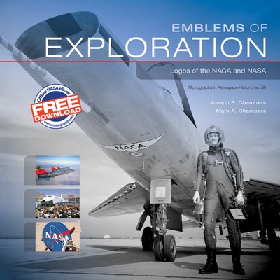
The history of NASA’s logos, and that of its predecessor agency, the National Advisory Committee for Aeronautics (NACA), is the subject of a recent NASA history publication, Emblems of Exploration. The book, freely available in electronic form, offers an interesting account of the evolution of NACA and NASA’s logos over the last century.
It’s interesting that, given NASA’s iconic logos, NACA did not have an official logo for much of its history. While established in 1915, as late as 1940 the agency’s executives said NACA had no official logo or insignia. An unofficial one, though, was in wide use by then: a shield with wings on either side, with “N.A.C.A.” inside. In 1941, that became the official NACA logo, tweaked several years later to turn “N.A.C.A.” into “NACA”.
When NACA became NASA in 1958, the new space agency wasted little time developing an official seal and logo, the latter becoming the now-famous meatball. The books sheds new light on one aspect of both the seal and logo: that V-shaped element variously called a “vector,” “slash,” and “hypersonic wing design.” The last description is the closest explanation to the inspiration for that feature: James Modarelli, head of a division at the Lewis Research Center (now Glenn Research Center) saw a model of an arrow-wing supersonic aircraft with a unique twisting shape. He incorporated that into designs of the NASA seal he submitted to agency officials and was was eventually approved. The design, though, needed one change: the original design had the wing upside down, apparently because Modarelli received an inverted photo of one of the models when working on the design.
| “Goldin had arrived on a Thursday, and by Friday morning NASA’s worm was officially gone, and the meatball was back.” |
Then there was the switch to the worm, and back again. The decision to replace the meatball with the worm in the mid-1970s took most in the agency by surprise, the book notes: it was not started in the agency but instead was part of the broader Federal Design Improvement Program, which updated graphics at dozens of federal agencies. Centers first learned about the new logo when center directors received stationery with the new logo, one person recalled. Even the NASA administrator at the time, James Fletcher, “had misgivings about the new design,” but ultimately approved it.
The switch back to the meatball was even faster. Just weeks onto the job as administrator, Dan Goldin visited the Langley Research Center. There, he was told by the center director and Goldin’s special assistant, George Abbey, that one way to restore flagging morale at the agency was to dump the worm logo. (Langley was one of the centers that lagged in incorporating the worm logo at its facilities, adding it to its main hangar only in late 1991.) Goldin made the decision on the spot, according to the book, to switch back to the meatball logo. “Goldin had arrived on a Thursday, and by Friday morning NASA’s worm was officially gone, and the meatball was back,” the book states.
The meatball has stuck around to this day, although the worm, while gradually fading from NASA facilities, is still lodged in the public imagination. (A recent crowdfunding campaign raised nearly $1 million to reissue the graphics standards manual for the worm logo.) That is perhaps a testament to the strength of the NASA brand, that it both its current and previous logo remain recognizable among the public. Alas, translating that brand recognition into public support, and thus funding, has been a far greater challenge.
